Sinking Deltas is an article in a research platform on carbon emissions. Users struggled to access data and understand the relationship between our carbon emissions and sinking cities, making it difficult to engage with the research.
TYPE
Research-Driven UX & Data Visualization
ROLE
UX/UI Designer: Redesigned navigation and information hierarchy. Created interactive visuals
TIMEFRAME
6 months
IMPACT
Reducing conversion rates by transforming a text heavy article into a visual story
CHALLANGES
How can we transform a text-heavy article into a visual interactive webpage?
Traditional text-heavy articles can be overwhelming, especially when users are skimming for key points or trying to make sense of dense material.
It is difficult to keep user engaged throughout the text while effectively conveying the necessary information.
Sustaining the user's excitement to read through an article without disengaging or getting bored.
MAIN GOALS
Improving readability and comprehension while keeping user engaged
UNDERSTAND THE MAIN PURPOSE OF THE ARTICLE AND MAKE SURE THE USER GETS IT
DEFINE HOW WILL THE USER INTERACT WITH AND ABSORB COMPLEX INFORMATION
FOCUS ON ALLOWING USERS TO EXPLORE AT THEIR OWN PACE AND TO THEIR LEVEL OF INTEREST
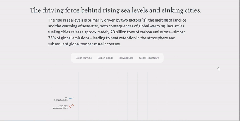
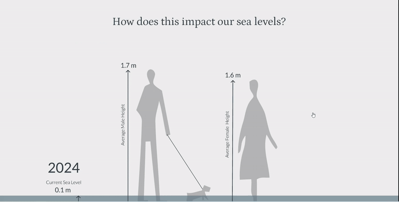
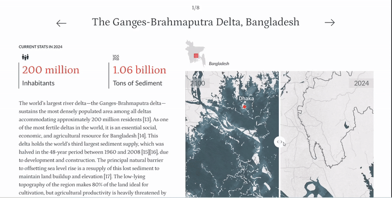
INCORPORATING INTERACTIVE MATERIAL THROUGHOUT THE ARTICLE TO KEEP USER ENGAGED
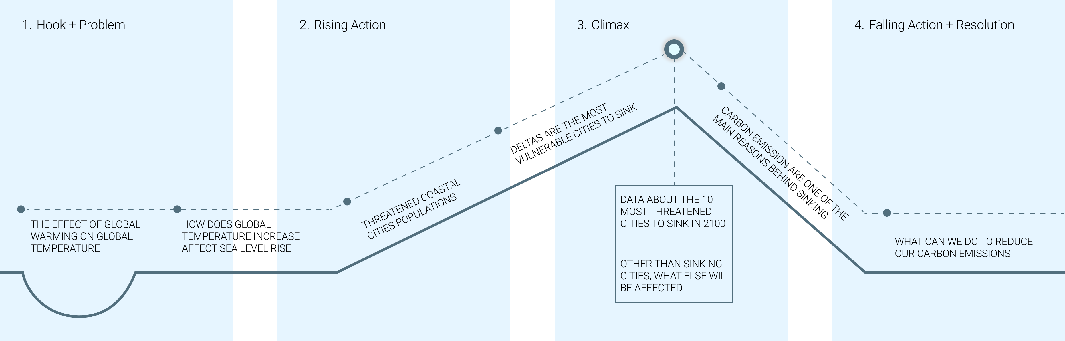
To effectively achieve the main goal, the article was structured using a story mountain framework to ensure optimal readability.
INITIAL PHASE
Developing a storyline and structure for the article
The video below shows the whole page, including the falling action and resolution visuals
OUTCOME
Design impact we delivered
Content became easier to scan, helping user quickly locate key insights.
Visual hierarchy and interactive elements enhanced engagement with the platform.
Stakeholders reported that the redesign made the platform more readable and professional.
KEY TAKEAWAYS
Resoloution
I learned the importance of structuring complex information for clarity and engagement, even without formal user testing.
Designing for complex information requires balancing detail with readability—too much simplification can obscure important findings, too little can overwhelm the user.
Interactive visuals can make dense data more engaging, but they need to be intuitive and contextually meaningful to be effective.