Hospital Service App
INTRODUCTION
Overview
Dar AlHekma Hospital is a private healthcare facility that aims to provide the highest quality in medical services. The Hospital is a patient-oriented facility that has team of healthcare professionals who are trained to deliver high quality care in confidential and caring manner.
ROLE
UX/UI Designer Please Note: This was a part of Google UX Course
TIMEFRAME
2 months
THE PROBLEM
Difficulty of accessing hospital services
Imagine needing a hospital service and having to spend a lot of time calling the customer service, waiting on the line, and understanding the details to be able to book a service. This is the current process that customers face to meet their desired needs, which requires a lot of time and effort from them to perform what is to some of them, a regular service. Due to a lot of misunderstandings that happened with the customer service, users are disappointed and the hospital is afraid to lose its regular users.
Main Challanges
Eliminate Barriers between users and hospital service.
Integrate All Services of the Hospital in One Platform
Design an easy to understand UI for familiar and unfamiliar users.
Provide a seamless booking experience.
MAIN GOAL
How Might We Give Users an easy and efficient process to use the hospital service?
USER GOALS: HAVE A FAST, EFFICIENT, AND EASY TO UNDERSTAN HOSPITAL SERVICE PROCESS
BUSINESS GOALS: HAVE A REGULAR CUSTOMER AND INCREASE BOOKINGS
THINKING PROCESS
Using design thinking for an iterative process to meet goals
USER RESEARCH
Project Kickstart: Focusing on developing a user centered design
1. Initial Questions
To make sure goals align with user needs, focusing on the user in the beginning of the project was necessary. User interviews were developed focusing on these questions:
WHAT ARE THE CHALLENGES CURRENTLY FACES BY USERS & WHAT THEY REALLY NEED?
BUSINESS GOALS: HAVE A REGULAR CUSTOMER AND INCREASE BOOKINGS
2. Empathy Map
After interviews were held, empathy maps were done to analyze the users' answers from the interviews.
3. User Personas were developed accordingly
4. Highlighting the User Pain Points after further analyzation.
BOOKING REQUIRES PATIENTS TO CALL, WAIT, AND DECIDE BETWEEN AVAILABLE DOCTORS.
CUSTOMER SERVICE ONLY SPEAKS ARABIC, MAKING EMERGENCIES HARDER FOR NON-ARABIC SPEAKERS.
USERS CAN'T RECALL ALL DOCTORS, PRICES. OR SEE PAST EXPERIENCE AND REVIEWS THROUGH THE PHONE
CUSTOMER SERVICE ALLOWS ONE-TIME BOOKING, SO MONTHLY APPOINTMENTS REQUIRE RECALLS.
5. Competitors Analysis
It was important at this phase to fully understand the market, several competitors were analysied. There are some of differences and pain points to competitors: - Offering different languages. - Too many info in one screen. - Distracting interface. - Hardly accessible, not easily understandable user flow.
USER STORIES
Seeing Through the User's Eyes
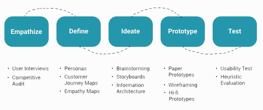
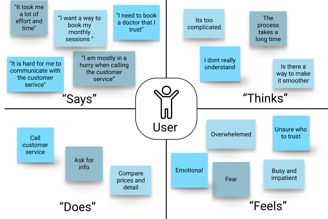
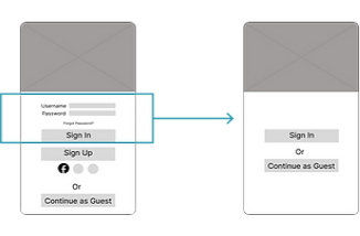
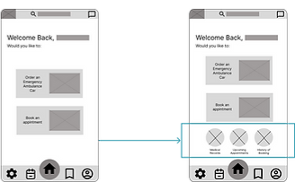
After understanding the users and competitors in the market, it was now time to understand the context which the users will be using the application. I did two user stories based on the personas of how the user will be using the app.
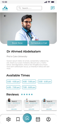
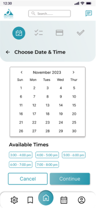
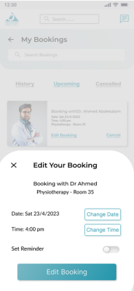
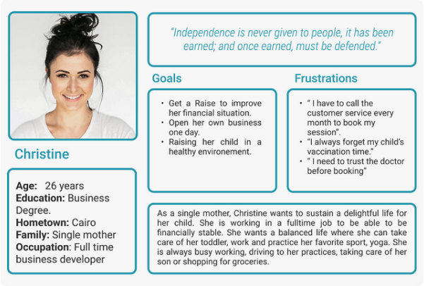
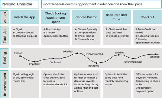
"Christine is a busy single mother who wants to schedule repeated physiotherapy sessions and get notified so that she can remember her monthly appointments "
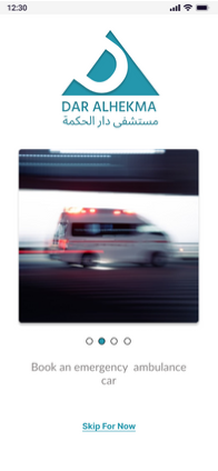
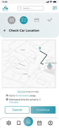
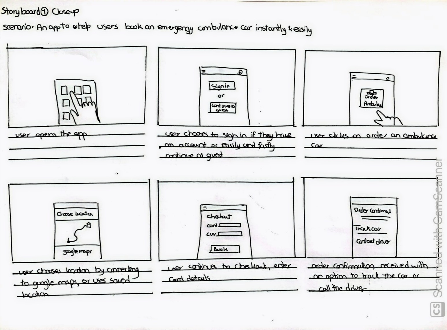
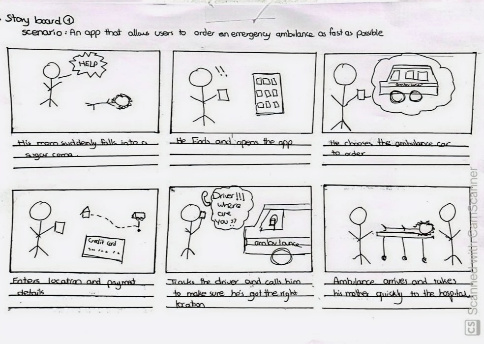
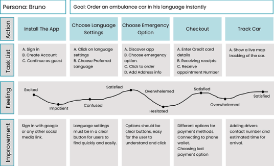
"Bruno is a foreigner who does not speak Arabic and wants to order an ambulance quickly and easily so that he can help his parents in emergencies "
1. Drafting Storyboards
I started imagining two scenarios in which users would be using the app.
2. Customer Journey Maps
In order to dive more deeply in understanding user emotions and interactions, I constructed customer journey maps, to be able to improve user interactions based on each phase of the user flow.
GETTING STARTED WITH DESIGN
Initial Brainstorming and Ideation Phase
1. Card Sorting
Starting the ideation phase, I stared by using sticky notes on the wall to be able to freely and quickly brainstorm all the ideas based on user research. Brainstorming was then refined to sort out the main features to be done in this app.
2. User Flow
To focus on the two main user goals in the app, I mapped out two user flows to illustrate the critical paths users will take when using the app.
DEEPER DESIGN PHASE
Next Phase: Design Development
1. Information Architecture
I then organized my ideas from brainstorming and started organizing them into a higher level structured diagram. It was created to gain a deeper understanding of the general overview of screens, navigation, how many levels of information and hierarchy.
2. Paper Wireframes (get pictures from editor x)
The next step was to visualize the different screens after understanding the connections between them based on the information I had from user research, scenarios and sitemaps. I started by sketching different options for each screen on paper wireframes.
DESIGN DEVELOPMENT
Moving Ahead and refining
1. Lo-fi Wireframes
I then turned my paper wireframes into digital interactive prototypes to be able to conduct early usability testing identify glaring issues.
2. Usability Testing
To test on low fidelity prototype, I conducted a usability test with five potential users and gathered the info collected on an affinity diagram to gather different patternsof insights.
3. Insights & Changes
A. Decluttering Screens Decluttering the welcome screen and having a separate welcome screen and sign in screen.
B. Homescreen Accessibility Adding icons for medical records and bookings in home screen so that they are easier to find instantly.
C. Ambulance Booking Adding details about emergency ambulance before booking like estimated time and location/distance.
D. Booking Process Adding progress bar so that users know where they are in the process of booking.
E.Payment Adding more clear options for payment and to add new or saved cards.
POLISHING SCREENS
Establishing a design system
FINAL DESIGN
Application solutions
1. Make important things fast
The main screen has been designed to allow users quick access to primary functions of the application. The size of the icons make tapping easier, the order of the icons are based on ease of reach and the layout was chosen to provide a way for the design to scale for future releases.
2. A Flexible Flow for Appointment Booking
The flow for booking appointments is a straight-forward process with a progress bar to guide the users throughout the process. Having all the options for the users, the interface design strives to be confident while having all unnecessary elements removed. I opted for clear, readable typography —choosing colors with high contrast to increase accessibility. 
3. Help Users Book Ambulance As Quick as Possible.
Giving users the choice to continue as guest, autofill profile and enter saved payment options to book as fast as possible. Adding options like tracking the car and contacting the driver to make after booking follow up as easy as possible.
50+ SCREENS
Final App Screens
1. Onboarding Screens
2. Booking An Appointment
3. Booking An Ambulance Car
4. Other
OTHER PROJECTS
View more of my projects
A project showing how UX and visual storytelling turned a text-heavy article into an engaging, interactive experience that keeps users exploring.
The transformation of a complex healthcare journey into a clear, accessible app that reduces stress and boosts patient engagement.
Desigining screens that would moderate the whole process from both the user and admin perspectives
Reap Medical Website
Zooming out to create the website that the user would use to reach the 1042US product.