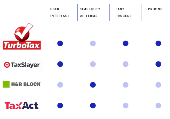
1042.US Dashboard
INTRODUCTION
Overview
US forms are known for their complexity, and the filing process can be especially overwhelming for small business owners. This is particularly true for those who hire a large number of remote, non-US employees. In addition to the regular forms that businesses are required to file, the paperwork becomes even more burdensome for business owners who manage it themselves, without the assistance of tax experts.
PROJECT
Hybrid SaaS
ROLE
UX/UI Designer bold
TIMEFRAME
6 months
THE PROBLEM/ MAIN CHALLANGE
Complexity of the current form
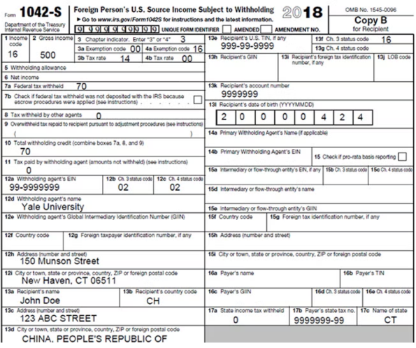
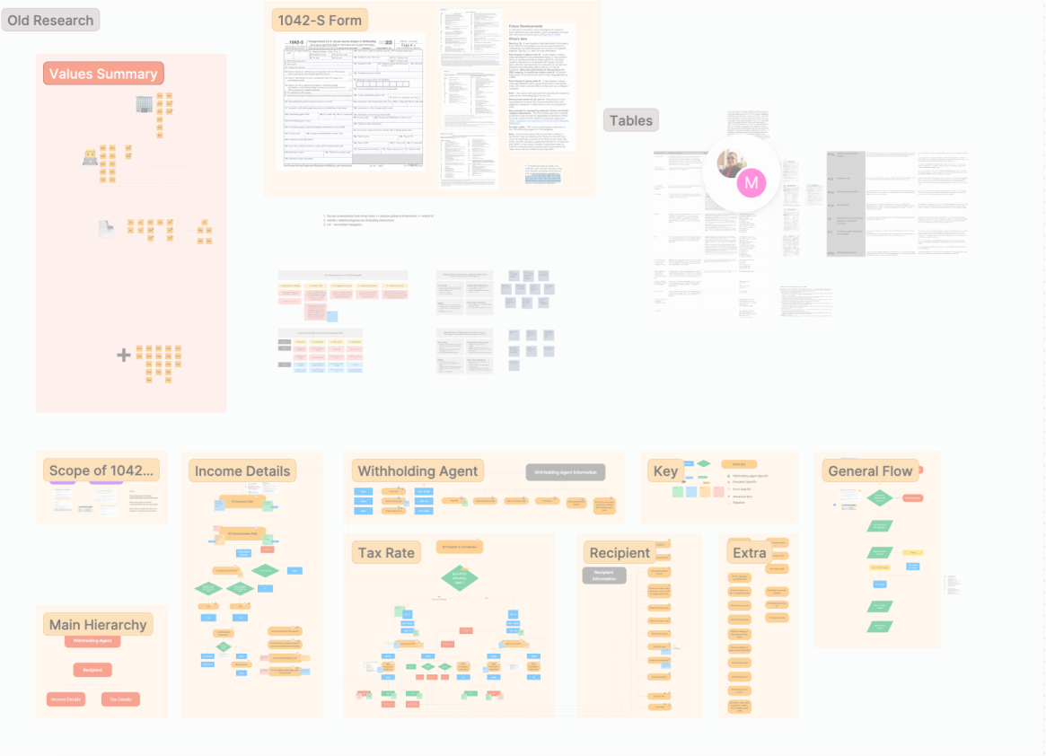
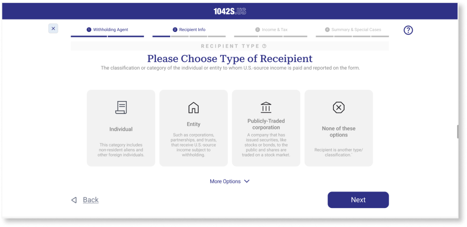
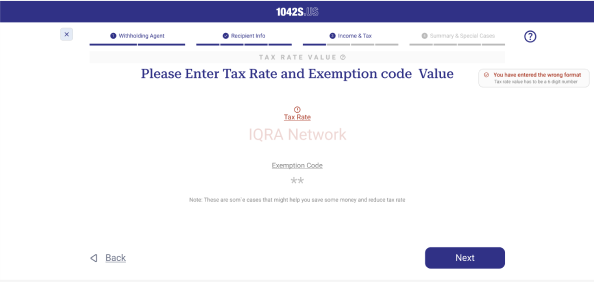
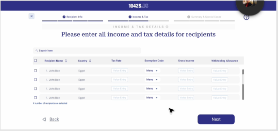
18 - 35 cells are required to fill according to each recipient situation. It can vary depending on the complexity of the situation, such as the number of income codes, exemptions, and tax treaty benefits being claimed.
A 40-page instructions booklet to comprehend and fill needed cells including special cases and tax treaty instructions
Would usually require several hours (around 3-5 hours) to comprehend and fill if a person is not familiar with the process of taxes.
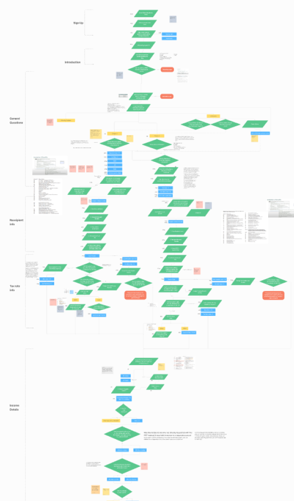
Before starting, it was important to review the form and introduction manual, categorize the fields, understand their relationships, and identify prerequisites & special cases.
MAIN GOAL
Transforming the complex process of tax filing be  into an interactive, comprehensive and easy to use experience
Our main goal was to make the user go smoothly through the flow without needing the help of a tax expert avoid the user being lost in the middle of the flow. Initial questions were asked:
HOW TO CREATE A SMOOTH COMPREHENSIVE PROCESS FOR THE USER?
HOW TO MAKE THE USER LESS OVERWHELMED ABOUT FILING THE FORM
HOW TO GUIDE THE USER THROUGH EVERY STEP AND REDUCE ERRORS
HOW TO MAKE  FORM EASIER TO UNDERSTAND WITHOUT    MANUAL BOOK
KICKSTART
Initial Exploration and Research
The primary objective of the initial research phase is to understand user needs, analyze how competitors address those needs, and establish a foundational vision to guide the project's development.
1. Interviews with business owner and tax filing person
Understanding targeted users was a necessary process to identify what are the goals needed to simplify the process as much as possible. User personas were created according to interviews held with business owners and tax experts.
2. Competitors analysis
Detailed analysis of competitors' screens, user process, and pricing plans to conclude what is needed to start, as well as understand the strengths and weaknesses in each product
3. Research Takeaways
A simple and easy process is needed by business owners to save their time
Users need to trust the product and know they won't send any errors to the IRS
Users need guidance throughout the process of filing as if they are asking a tax expert
4. Initial Conceptual Direction:
Concluding the initial research process, a set of goals and direction have been settled on:
Having a question or a set of related questions on one screen so the user can focus on one field at a time, making it less complicated and overwhelming
THE THINKING PROCESS
Deepened research: Understanding the form and narrowing the scope
1. Deep Research Phase
To organize and deeply study the form, I had to put myself in the shoes of a tax expert; the challenge here was that the form is very complicated and all fields are interlinked.
GOING THROUGH FORM & UNDERSTANDING NEEDED FIELDS
CLASSIFYING THE FIELDS INTO CATEGORIES
LINKING ALL PIECES TOGETHER
2. User Flows
Based on the initial categorization, four user flows were developed, along with a general flow to determine the user's eligibility to file the form.
RESULTS OF THIS PHASE: ALL FLOWS WHERE CONNECTED INTO A SUPER LONG USER FLOW INCLUDING ALL SPECIAL CASES
APPLICATION ON SCREENS
Now it was time to transform all the data we had to screens and to prioritize needed screens to develop a MVP
Main questions/goal in this phase: How can screens be easy to navigate? how can the user focus on one question at a time? How can we guide user to find needed info (where data can be found etc.)
ONE QUESTION PER SCREEN TO KEEP USER FOCUSED
PROGRESS BAR: TO KEEP TRACK OF HOW MUCH IS LEFT, WHERE THE USER IS IN THE FLOW
TOOL TIPS: EXPLAINING THE PURPOSE OF EACH PAGE
BRIEF EXPLANATION FOR EACH OPTION TO CHOOSE
HELP CENTER TO GUIDE USER THOUGHOUT THE PROCESS
REFINING UX DESIGN & ITERATIONS
Back and forth in research, meeting with clients additional requirements
1. Comments received from the client: Focusing on errors system
IRS sends back a lot of forms with format errors, and the user would need to correct and resend them to prevent/reduce that: Implementing errors for needed formats, micro-interactions, error states, and error screens were designed accordingly to avoid the user continuing in the wrong direction
2. Suggestions to Client: Forms uploading page
Linking that a lot of forms that were previously filed for employee can have data that can be reused in 1042 S, so simply by scanning these forms, this step would help skip a lot of question for the user and save more time
3. Challenge - Bulk Entry System: Client requested having a flow for entering multiple forms at the same time
A challenge that came up in the middle of the process was having to assume that the user might need to apply the form for several employees which required designing each page accordingly to accommodate for multiple users' entry
REFINING UI DESIGN
UI design system and using templates, components for over 100 screens
Design system, components design, and template for different screens to accommodate different questions, making it easier for the developers and for the user to get used to using the form. Designing components for all screen sizes to ensure responsiveness.
ORGANIZING WORK
Delivering to developers
To provide developers with a clear and consistent screen flow, a new user flow was created using a coding system that had been agreed upon by the team, streamlining the implementation process.
KEY TAKEAWAYS
Resolution
Communicating with developers necessitates a well-structured and logically coherent approach to ensure mutual understanding.
Iterative testing and continuous feedback loops significantly contributed to enhancing the product's quality and performance.
Establishing a well-structured and organized framework from the outset is crucial for efficiently handling projects with a large page count.
Proactively offering suggestions to clients while incorporating their feedback helps expand the vision and broaden the project's scope.
NEXT STEPS
Taking a step back to design website to access this form and user and admin screens
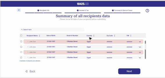
After being done with designing the 1042US MVP, it was time to take a step back to design the website where user can access the form, and the admin page for moderating the forms.
OTHER PROJECTS
View more of my projects
Desigining screens that would moderate the whole process from both the user and admin perspectives
A project showing how UX and visual storytelling turned a text-heavy article into an engaging, interactive experience that keeps users exploring.
The transformation of a complex healthcare journey into a clear, accessible app that reduces stress and boosts patient engagement.
1042US Website
Zooming out to create the website that the user would use to reach the 1042US product.