Healthcare Provider
Internal Dashboard
INTRODUCTION
Overview
Designing a centralized care operations dashboard. A complex internal platform connecting clients, carers, visits and operational teams — replacing fragmented spreadsheets and files with one structured system.
TYPE
Hybrid SaaS
ROLE
UX/UI Designer · End-to-end design · Developer handoff
TIMEFRAME
4 months
USERS
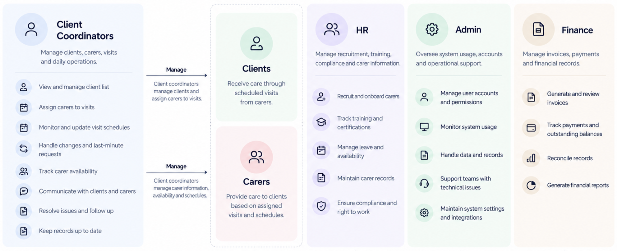
Teams: Client Coordinators · HR · Admin · Finance
MAIN CHALLANGE
Turning a fragmented operation into one connected system
They already had a dedicated app where carers could manage their visits and record what happened during them.
Behind that experience, however, Domcare's internal teams relied heavily on Excel spreadsheets and Dropbox files to manage the operation.
Information about clients, carers, visits and other operational activities was distributed across different files, making it harder and more time-consuming to find information and manage daily operations.
This wasn't simply a dashboard containing a lot of data.The system had to represent multiple interconnected entities and workflows
MAIN GOAL
Create a centralized dashboard with stuctured, connected and actionable info.
Our main goal was to make the user go smoothly through the flow without needing the help of a tax expert avoid the user being lost in the middle of the flow by guiding the user on what to do next and where to extract needed info from
KICKSTART
Understanding each team main workflows and the current system.
The primary objective of the initial research understand the multiple entities and
12+ stakeholders interviews were done
Focus Areas:
Daily workflows, key metrics, pain points and efficiency challenges
Deliverables:
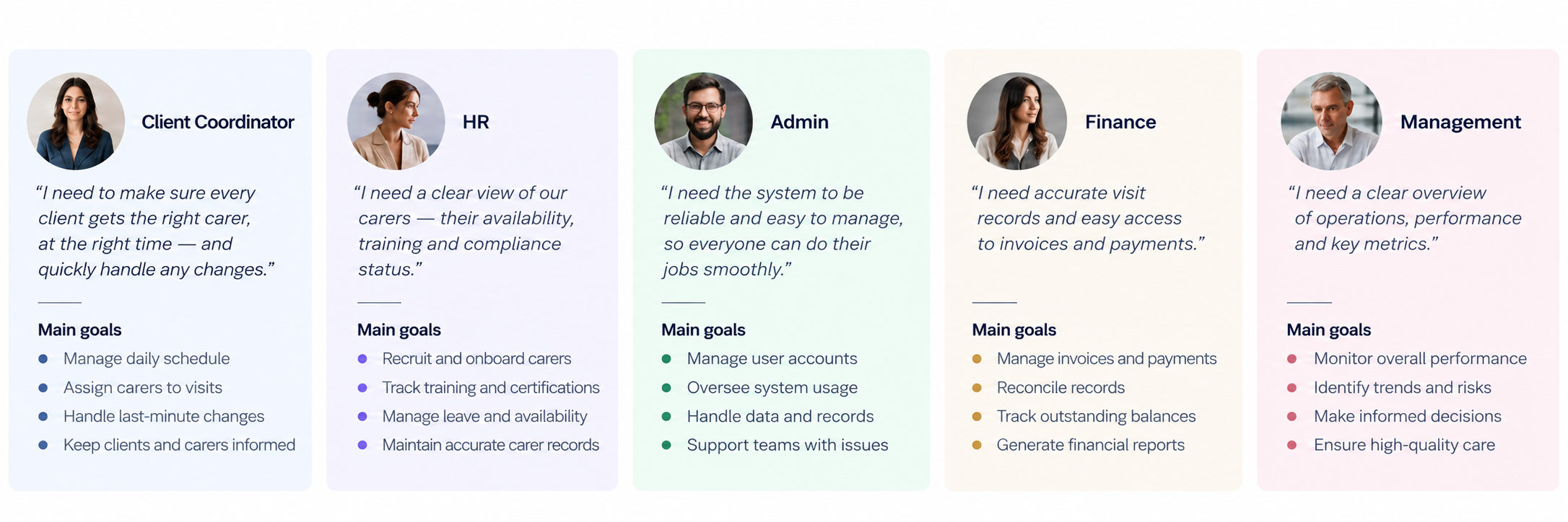
User personas were created.
Mapping the current information they're using and relations between the info
Detailed analysis of competitors' screens, user process, and pricing plans to conclude what is needed to start, as well as understand the strengths and weaknesses in each product
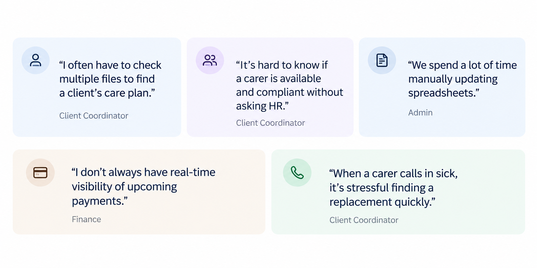
User Pain Points:
Analysing users daily workflows
Detailed analysis of competitors' screens, user process, and pricing plans to conclude what is needed to start, as well as understand the strengths and weaknesses in each product
3. Research Takeaways
We analyzed interviews, observations and system mapping across all groups to uncover reocurring themes. These insights highlight what users need and directly inform the design decisions
BRAINSTORMING & DEFINING
From insights to ideas. Turning complexity to simplicity.
How Might We?
Turning user pain points into how might we questions to keep focus on user needs and opportunity areas.
Brainstorming Session
Running an ideation session to generate a wide range of ideas before narrowing them down.
Mapping the key user journeys
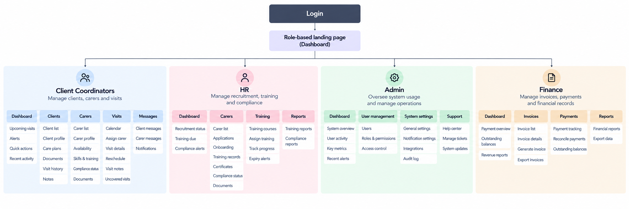
Main user flows were created to define the steps, decision points and system interactions. These flows are designed to keep a clear, intuitive experience that supports the real-world workflows and reduces manual work.
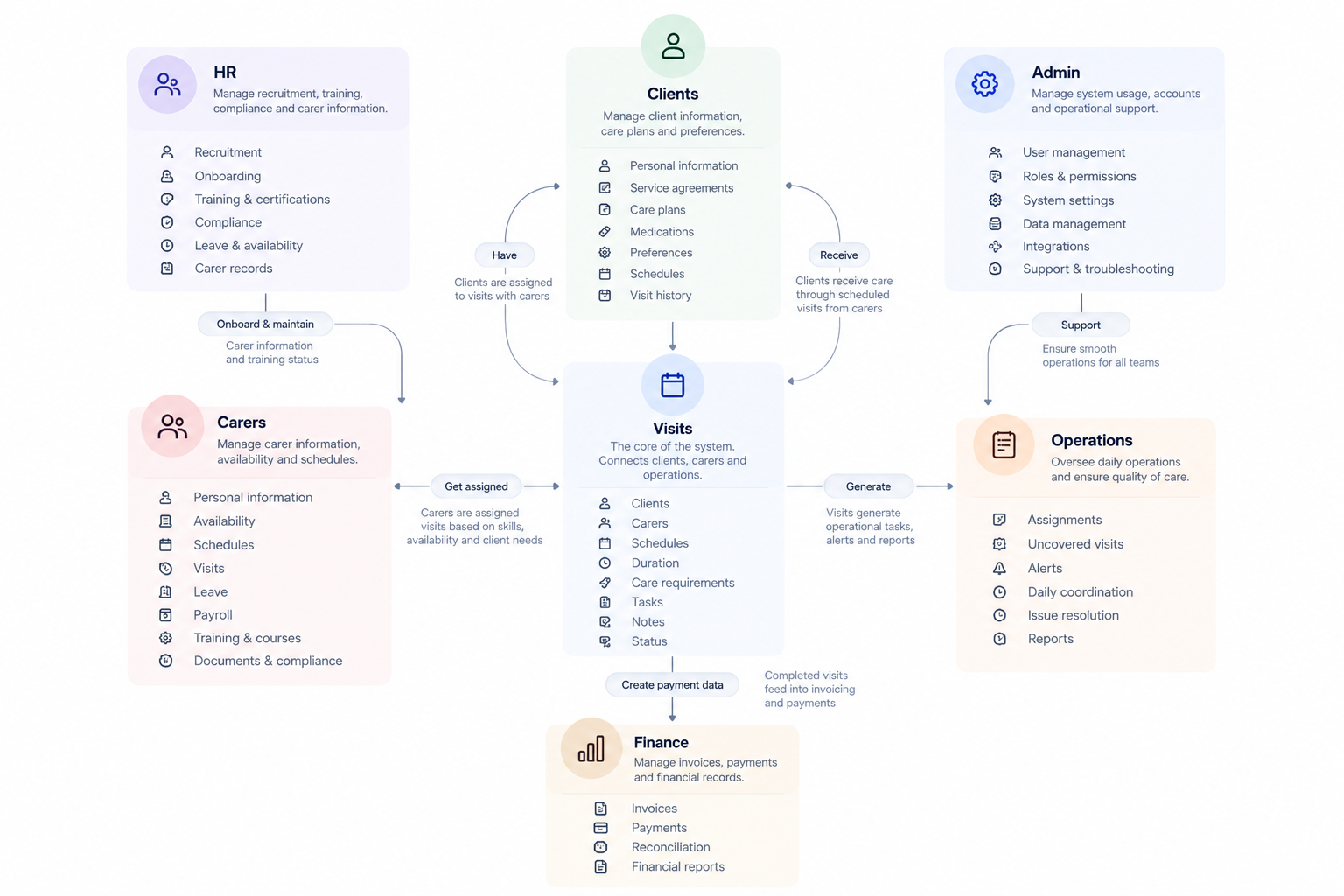
Information Architecture
Main user flows were created to define the steps, decision points and system interactions. These flows are designed to keep a clear, intuitive experience that supports the real-world workflows and reduces manual work.
IDEATION
From ideas to direction
Sketching Concepts
Initial screens and wireframes were created for key screens to be tested with the team. Testing concluded the final design decisions that were later translated to high fidelity screens
Concept Exploration
Multiple directions for key areas of the project were explored. Different approaches were tested to find the best balance between simplicity and functionality.
DESIGN SYSTEM AND UI
From ideas to a usable screen
Design system: A consistent foundation
A flexible and consistent design system was created to ensure a unified experience across all roles and future scalability
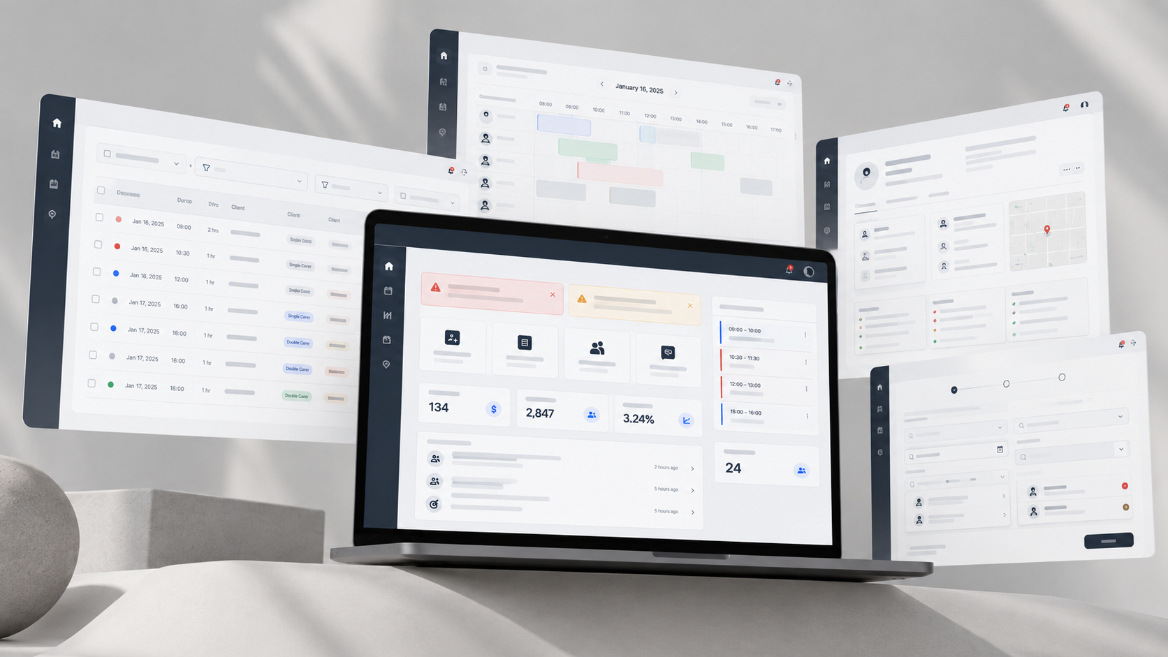
Final screens for each role
A flexible and consistent design system was created to ensure a unified experience across all roles and future scalability
OTHER PROJECTS
View more of my projects
Transforming complex U.S. government forms into a simple, user-friendly digital experience.
Turned heavy research content into a visually clear, engaging story.
Hospital Service App
Simplified patient interactions with hospital services through clear, intuitive design.
Reap Medical Website
Zooming out to create the website that the user would use to reach the 1042US product.